Overview
Randstad Sourceright needed to modernize a 25-year-old recruitment platform: thousands of screens, inconsistent patterns, fragmented experiences. Leadership decided to decompose the monolith into four specialized applications, with 50+ engineers ready to build immediately and no capacity to redesign screens one by one.
I led the Malaysia design team as part of a global effort spanning the Netherlands, Australia and Malaysia to build a cohesive design system that enabled rapid, uniform development across all four applications. Because those four applications spanned three different front-end stacks, vanilla JS, Angular and React, every component had to render and behave identically across all of them.
The challenge
- 25 years of accumulated design inconsistency across thousands of screens
- No shared component library, every screen designed independently
- Outdated patterns that failed modern usability standards
- Four development teams building simultaneously on an aggressive 2-year timeline
- Four applications serving different user contexts, no one-size-fits-all
Critical realization
We didn't have a screen design problem. We had a scalability problem.
Why traditional redesign would fail
Early math made it obvious: tens of thousands of screens at 2–3 days per screen meant years of work, while four parallel teams guaranteed inconsistency. No designer could review every screen 50 engineers would create.
The solution wasn't better individual screens, it was a system that enabled engineers to build consistently without bottlenecking on design review.
Research & strategic planning
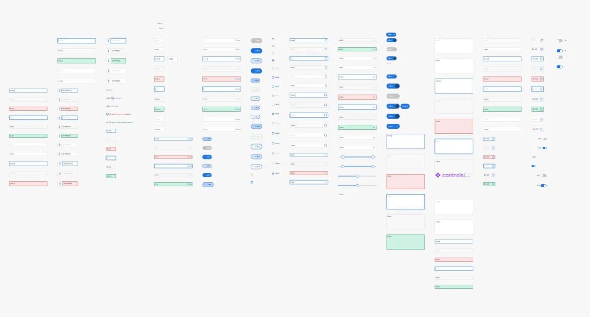
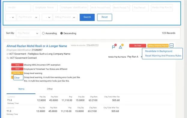
A comprehensive legacy audit surfaced common UI patterns (data tables, forms, navigation) repeated thousands of times with slight variations, critical workflows buried in inconsistent interfaces, and years of ad-hoc UI decisions made without documentation.
With Business Analysts and the Product Owner, I mapped existing user flows to separate legacy decisions that had valid reasoning from ones that were simply outdated, and answered the key questions: which patterns to preserve for familiarity, which to modernize, and how to balance consistency with each application's context.
The solution: a flexible system at enterprise scale
Rather than rigid templates, I built a modular system on atomic design principles, adaptable to four different application contexts.
Foundation layer
- Core design tokens: color, typography scale, spacing, elevation
- WCAG 2.1 AA accessibility baked into every component
- Responsive grid system and breakpoint strategy
Component layer
- Atoms: buttons, inputs, labels, icons
- Molecules: form groups, data cards, search bars
- Organisms: complex data tables, multi-step forms, dashboard widgets
- 60+ reusable components covering 80% of common UI patterns
Application layer
- Templates optimized for each application's primary use cases
- Context-specific patterns (candidate-facing vs. recruiter-facing)
- Flexible enough for edge cases without breaking consistency
Developer enablement
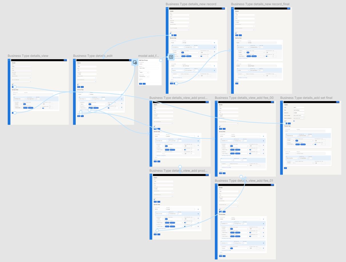
- Figma library matching code implementation exactly
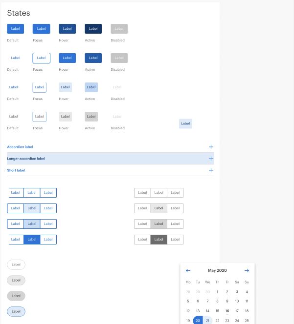
- Implementation docs with code snippets and all component states
- Guidelines explaining when to use components, not just how, with dos and don'ts
Key design decisions
Data density without sacrificing clarity
Enterprise recruitment is data-heavy. Components balanced density with scannability: clear hierarchy through consistent spacing and type, sticky-header sortable tables, and progressive disclosure for detail.
Adaptability built in
Configurable building blocks with clear defaults, design tokens that kept teams consistent while addressing specific needs, and layouts that flexed across data volumes and screen sizes.
Implementable by design
Every Figma component had a matching code implementation, specs covered all states (default, hover, active, disabled, error), and regular syncs with engineering leads kept "how do I build this?" questions near zero.
Governance & adoption
To support 50+ engineers: usage guidelines and decision trees in Figma, office hours for developer questions, design review checkpoints at milestones, a Slack channel for quick clarifications, and a working group with version control and release notes for system evolution.
Outcome
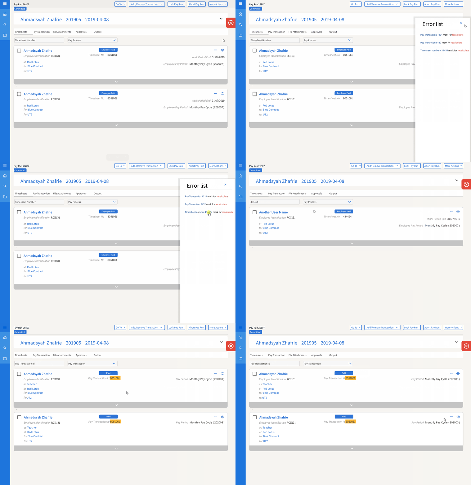
Three web applications launched in parallel without design bottlenecks, with the foundation laid for a fourth native mobile app. The efficiency itself had an unexpected side effect: launching ahead of schedule prompted the company to restructure priorities, and the mobile app was deprioritized.
Key takeaway
Design systems are organizational transformation tools, not just component libraries, and success can be complicated.
What I'd do differently
- Define post-launch value metrics earlier: adoption rates, design debt prevention, time saved on future features, so stakeholders see that systems need ongoing stewardship, not just delivery.
- Make the mobile roadmap more visible to leadership so the fourth application's dependency on the system was harder to deprioritize.
- Communicate the risks of "too much efficiency": finishing early created the impression the work needed less ongoing investment than it really did.