The problem
When developers intensify how a piece of land is used, the local authority charges them a fee. Right now that whole process limps along on forms, email, and spreadsheets. Applicants have no real idea where their submission stands. Officers review it against rules that mostly live in their heads or buried in scattered documents. And payments, surcharges, and missing files all get chased down by hand.
So the brief was one portal for two people who want very different things. The applicant just wants to submit, pay, and know what's going on. The officer wants to get through reviews quickly, ask for whatever's missing, and approve or reject with a record of why. Those goals pull in opposite directions, and the same interface has to keep both of them happy.
A note on context
Quick bit of honesty first: this was a design exercise from a hiring process, not shipped client work. I'm including it because it shows how I think across a whole system when the clock is running, and because the prototypes are actually clickable rather than static frames. I've generalised the scenario and any client details.
My approach
I didn't open Figma first. I started by laying the two journeys side by side and looking for the moments where they meet: submission, document checks, payment, and the officer's decision. Those hand-off points are usually where a portal like this falls apart, so I designed them first.
From there I built the screens as coded prototypes instead of static mockups. When a workflow has this many states, the only way to really test it is to click through them yourself. A flat frame can't show you what an overdue payment or a rejected document actually feels like.
What I built
Five screens, each with its full range of states. Honestly, that's where most of the design work lives; the happy path is the easy part.
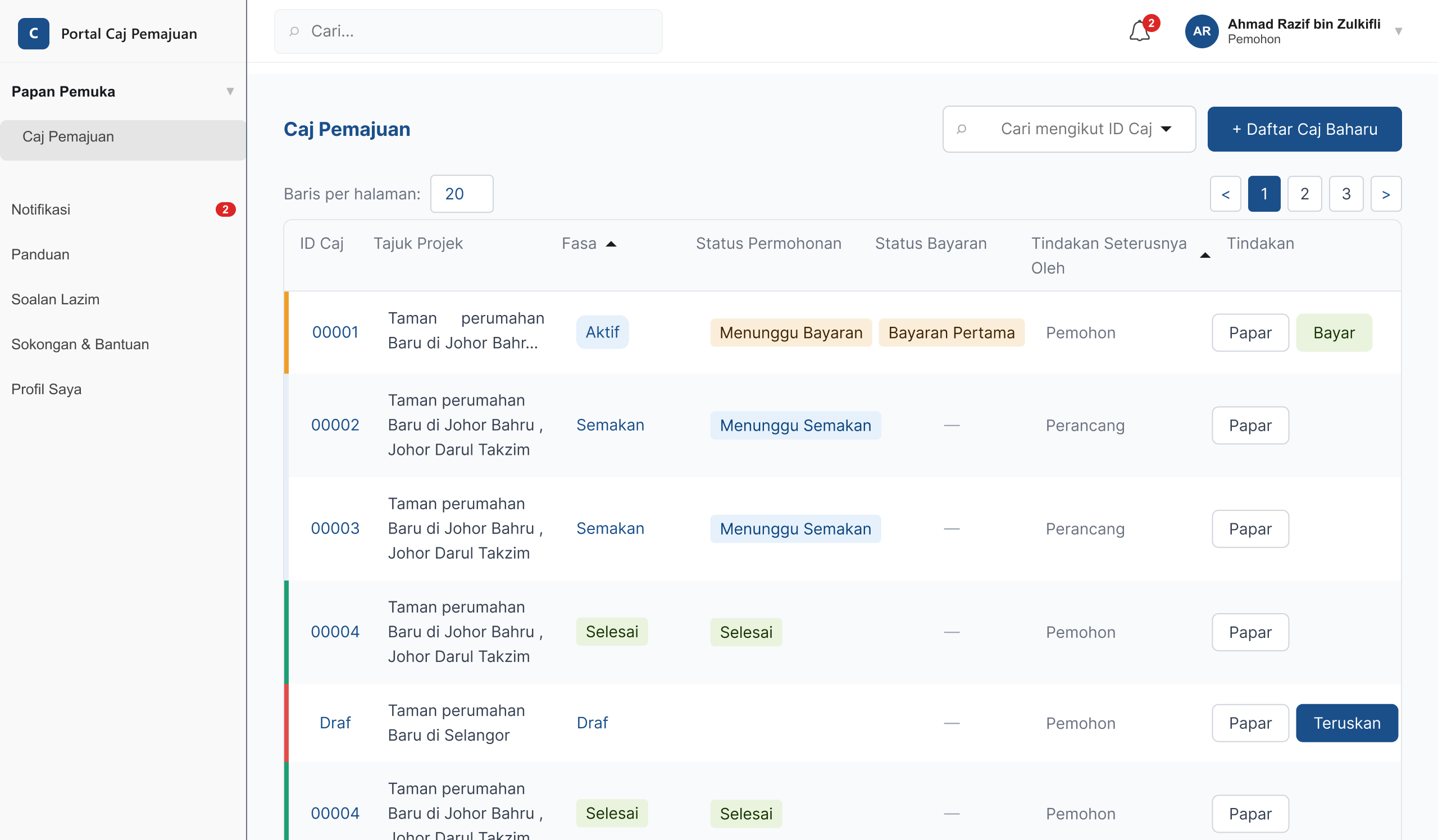
- Applicant dashboard. The first thing you see on login, built to answer one question fast: what do I need to do next? States: empty, in progress, action needed.
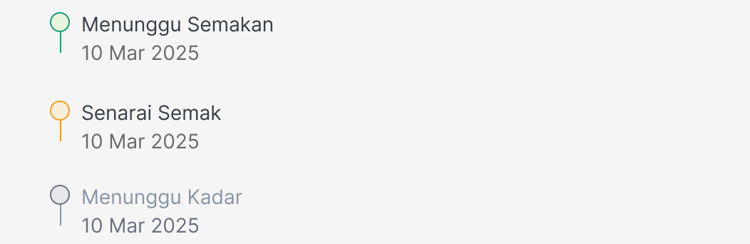
- Application detail. Where the applicant follows a single submission through review and replies to whatever the officer asks for. States: under review, docs requested, resolved.
- Payment submission. Where the tricky cases hide. If a payment's late it adds a surcharge, and the screen has to explain that clearly. States: standard, overdue + surcharge, confirmed.
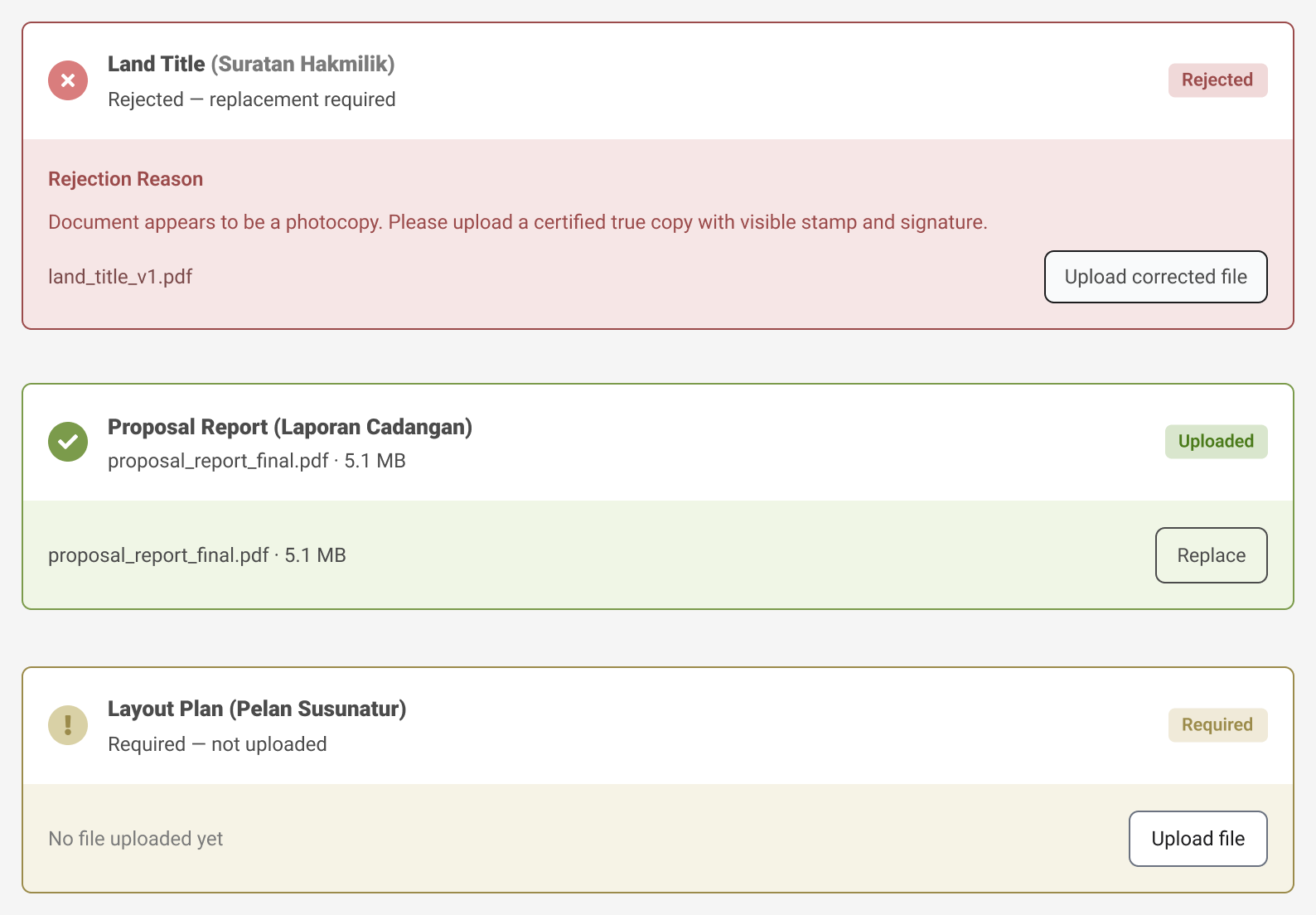
- Document upload. A checklist-style flow, so missing files surface here instead of the officer having to chase them. States: accepted, missing, rejected.
- Officer review. The busiest screen of the lot. Three decisions, each with its own confirmation and knock-on effect, split across linked screens so the whole path tests as one flow. States: queue, approve, request docs, reject, confirmed.

Designing the edge cases
In a compliance portal, the happy path is never the interesting bit. What matters is everything that can go wrong and who gets stuck dealing with it. So I worked through the messy stuff: dodgy or unreadable documents, expired and mismatched submissions, half-finished applications, late payments and the surcharge maths that follows, and the officer having to reject something and explain why. Each of those got its own screen state instead of a line in a spec nobody reads.
The edge case I'm most proud of
A surcharge isn't really a number in a spec. It's the moment someone realises they owe more than they planned for. So the overdue screen spells out the new total before they pay: the original charge, the penalty on top, and the reason it's there. I didn't try to soften it, I just made sure nobody could miss it.
The screens, up close
Six screens from the two sides the brief had to cover: the applicant's and the reviewing officer's. The applicant ones include the round-three UI changes I added later, namely a clearer charge breakdown, a choice of how to pay, and the overdue surcharge state. Tap any thumbnail to see it full size.
Beyond the screens
I treated this like a real hand-off, not a demo. Next to the prototypes I put together a component and design-system spec: colour tokens, a type scale with line heights, spacing, and component states. I also wrote a developer reference doc with exactly what an engineer needs to build it, down to tokens, anatomy, states, and accessibility notes with their contrast ratios. It's the kind of doc I'd normally attach to a Jira ticket, and I included it so you can see how I actually hand work over, not just what I can draw.
Deliverables & craft
Two days means making peace with some trade-offs. Given more time, I'd have put the officer flow in front of an actual reviewing officer instead of my own best guess at one, and moved the prototypes out of quick HTML into a proper repo so the design system and the screens stayed in sync. I'm confident in the thinking; it's the testing that a two-day window just doesn't leave room for.
Why this sits in my portfolio
Most of my other case studies are led by research and numbers, and they're under NDA, so you get the outcome but never the screens. This one's the opposite. Here you can actually see the craft: the stateful flows, the edge cases, the prototypes you can click through yourself. It's also the best example of how I increasingly work, designing in code when that's the quickest route to something I can put in front of people.